
If you open a wellness app today and it immediately asks you to complete a 15-step morning routine, log your water intake, write a 500-word gratitude entry, and maintain a 365-day streak to keep a virtual plant alive, it has already failed you.
At ViviDiary, we've spent the last year watching a massive shift in how people interact with digital products. Users are exhausted. They are experiencing severe feature fatigue from bloated interfaces, prescriptive AI, and demanding daily quotas.
We realized early on that building a better modular mood tracker didn't mean building more features. It meant building less.
Here is a candid look at how we are applying underconsumption core UX design to ViviDiary, the bloated "all-in-one" dashboards we killed along the way, and why radical data minimization is the only way forward for wellness apps.
What TikTok's "Underconsumption Core" Means for Product Design
The "underconsumption core" trend started on social media as a rebellion against physical hoarding—influencers proudly showing off their single, well-used tube of moisturizer instead of a drawer full of unused skincare products.
But as we dug into our user research for 2026, we noticed this mindset bleeding heavily into digital spaces. Users were actively deleting apps that demanded too much of their time or emotional energy. We call this TikTok wellness app fatigue. People don't want another digital chore; they want a quiet space that scales to their emotional capacity on any given day.
In product design, underconsumption core UX design is a minimalist philosophy that rejects feature bloat in favor of intentional, constrained user experiences. It means:
* Opt-in complexity: The app is dead simple by default. You only add what you need.
* Zero guilt: No streaks, no red notification dots yelling at you for missing a day.
* Pacing over engagement: We want you to log your mood and leave, not scroll through endless content.
When we looked at the industry standard—apps heavily reliant on gamified pressure and hyper-engagement—we knew ViviDiary had to go in the exact opposite direction.
5 Principles of Underconsumption Core UX Design at ViviDiary
Translating this philosophy into a functional product required strict discipline. Here are the five principles that govern our product roadmap.
1. Modular by Default (Start at Zero) When a new user downloads ViviDiary, the app is almost entirely turned off.
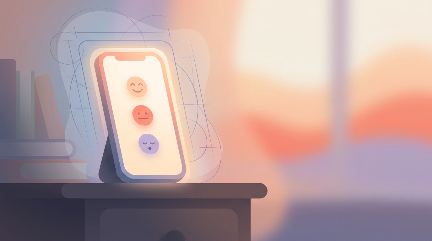
The only required input is Mood. We use a simple 5-level, name-based system: Great, Good, Okay, Low, Rough. That's it. Everything else—Memo, Voice, Photo, 22 manual emoji modules, and 4 HealthKit auto-categories—is toggled OFF by default.
In early testing, we tried turning everything ON to show off the app's capabilities. The result? A 62% drop-off in week-one retention. Users felt overwhelmed. By embracing a modular mood tracker ux, we let users intentionally opt-in to the modules they actually want. You only consume the interface you need.
2. The 30-Second Rule We practice anti-attention design. Our goal is for a core check-in (mood + energy + emojis) to take under 30 seconds, with zero writing required.
If you want to write a long diary entry, you can. But on a "Rough" day, when you barely have the energy to get out of bed, a 3-second emoji tap is enough. We consider it a product failure if ViviDiary monopolizes your screen time.
3. Focus Without Pressure (Killing the Streak) The industry standard for habit tracking is the gamified streak. It works for language learning, but for mental wellness, it's toxic. Streaks create panic, streak-freeze anxiety, and broken-streak guilt.
We built our Focus module (Routines + Todos) differently. A Routine is simply something you want to notice and keep up; a Todo is a per-day item you strike through.
We explicitly rejected pressure-style mechanics. There are no completion percentage traffic-lights, no achievement rates, and absolutely no "you missed today" guilt notifications. Routines keep a gentle personal-best count. If you miss a week because life happened, the app just waits quietly for you to come back.
4. Observation Over Prescription We present your data back to you via the "Mirror" feature (our pattern discovery tool across Time, Activity, People, Focus, and External domains).
The Mirror updates weekly on Sunday mornings and is available on-demand. We do not send daily push notifications saying, "You usually feel Low on Tuesdays, do some yoga!" The tone of ViviDiary is consistently "Warm (따뜻하게)." We sit beside you; we don't coach you. The patterns are for your observation, never our prescription.
5. AI as an Optional Helper, Not the Core AI is not our core selling point. It is an optional supporting tool for the days you want to reflect more deeply.
Our AI does not create content without conversation, it does not save or confirm anything without your explicit review, and it certainly does not provide therapy or diagnosis. It's just a helper for when you want to untangle a complex thought, completely opt-in.
!Underconsumption core UX design wireframes showing minimal UI
What We Rejected: The "All-in-One" Wellness Dashboard
Readers of this blog know I love sharing the road not taken.
About eight months ago, we prototyped a version of the app internally dubbed "The God Dashboard." It was a massive, single-screen UI that pulled in your mood, your sleep data, your step count, your daily routines, and a predictive AI score of how your day was going to go.
It looked incredible on a Figma canvas. Investors would have loved it.
Then we put it in front of users.
During user testing, we asked participants to open The God Dashboard while imagining they were having a terrible, low-energy day. 8 out of 10 users physically sighed or groaned when the screen loaded. One user told us, "Looking at this makes me feel like I'm already failing my day, and it's only 9 AM."
We immediately scrapped it.
We realized that complex biometric dashboards demand too much cognitive load. When you are stressed, you don't want a dashboard; you want a blank page or a single, simple question. We threw away weeks of engineering work to return to our minimal, modular roots.
Data Minimization: Why We Don't Build Omniscient "AI Brains"
When you build less, you inherently collect less. This brings us to a critical, non-negotiable part of our product philosophy: privacy through data minimization.
There is a massive trend right now of apps trying to build an "omniscient AI brain" that knows everything about you—reading your calendar, scraping your photos, and hoarding your raw data to build a complex psychological profile.
We refuse to do this.
At ViviDiary, our data layer is cloud-stored using Supabase. We chose a privacy-first cloud architecture because it allows us to offer seamless syncing and reliable backups (like our 3-month calendar archive on the Free tier) without compromising your trust.
- Data Minimization: We only collect what you explicitly log. We don't scrape your phone in the background.
- Strict De-identification: Before any of your diary text touches our optional AI processing tools, it is completely de-identified.
We don't rely on common marketing tropes about keeping everything offline because, frankly, making false promises about where data lives is a dangerous game in consumer tech. True privacy comes from not needing the data in the first place and ensuring that whatever does hit the cloud is stripped of its identity.
Our AI is opt-in because the core value of ViviDiary is the 3-second mood and emoji log. The AI is just a helper for the days you want more depth. By keeping the AI optional and de-identifying the data, we protect your privacy at the architectural level.
The Tradeoffs of Building Less
I won't sugarcoat it: choosing an underconsumption core UX design comes with real business tradeoffs.
If you look at traditional product metrics, our "Time in App" is intentionally low. We don't have gamified loops to artificially inflate our Daily Active Users (DAU) count. We give away a massive amount of value on our Free tier (all input modules, unlimited mood logging, weekly Mirror, up to 3 Routines and 5 Todos) because we believe core mental tracking shouldn't be paywalled behind forced engagement.
When you don't use streaks, you lose that frantic, panic-induced retention spike that happens at 11:45 PM when a user realizes they are about to lose their 30-day streak.
But here is what we gain instead: Trust and long-term retention.
Our 90-day retention curve is incredibly flat compared to the industry average. Users might skip logging for four days, but they come back on the fifth day because they know ViviDiary won't yell at them. They know they won't be greeted by a broken streak or a guilt-inducing notification.
As we look at wellness app design trends 2026, it's clear that the era of the hyper-optimized, demanding wellness app is ending. Users are migrating toward anti-optimization wellness apps that respect their time and mental load.
ViviDiary is designed to be the quietest app on your phone. By building less, we've created a space that actually has room for you.
*
What features are you tired of seeing in wellness apps? We're always iterating based on what you actually want (and what you want us to remove). Drop us a line at the feedback email in your app settings.