Our most successful product metric last quarter was a 40% drop in average session length.
If you pitched that to a Silicon Valley growth board, you'd probably be laughed out of the room. The consumer app playbook is built on maximizing "time in app." You build infinite scrolls, you gamify streaks, you send "you missed your goal!" push notifications, and you trap user attention for as long as humanly possible.
But at ViviDiary, we build a mood and life tracker. And the truth is, if you are spending 20 minutes a day staring at our app, we have failed you.
Today, I want to talk about anti attention design wellness apps, why we actively want you to leave ViviDiary as quickly as possible, and how designing for faster exits actually drove our long-term retention up by 32%.
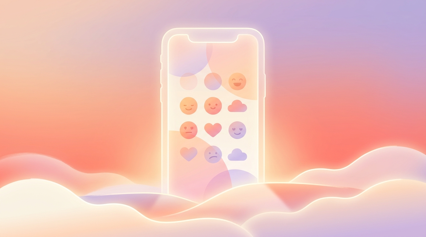
!Anti attention design wellness apps concept showing a clean, minimal interface
The Toxic Metric: Why We Stopped Measuring "Time in App"
The Problem When we first started building ViviDiary, we looked at the landscape of mental health and habit-tracking apps. Almost all of them were infected by what we call "toxic maxxing"—the hyper-productive, optimization-obsessed culture that turns self-care into a competitive sport.
We noticed users were exhausted. They were abandoning wellness apps because the apps themselves became sources of anxiety. If you missed a day, your streak broke. If you didn't log enough detail, your progress bar stayed red.
The Approaches We Considered 1. The Gamified Approach: We considered building a robust streak system with streak-freezes and completion percentages. Pros: Short-term DAU (Daily Active Users) spikes. Cons: High 30-day churn due to guilt. 2. The Content Trap: We tested adding a feed of wellness articles and daily quotes to keep people scrolling after they logged their mood. Pros: Increased session length. Cons: It distracted from the core utility and contributed to cognitive overload. 3. The Anti-Attention Approach: What if we built a low stimulation UX designed to get you in and out in under 30 seconds?
What We Chose (and Why) We chose the anti-attention route. We realized that the emerging slowmaxxing wellness trend wasn't just a buzzword; it was a desperate plea from users who wanted tools that sat quietly beside them, not coaches screaming in their faces. We wanted to be one of the anti-optimization wellness apps that respected attention as a scarce resource.
What Anti-Attention Design Actually Looks Like in ViviDiary
To build a truly calm technology, we had to rethink our entire onboarding and default state.
ViviDiary is strictly modular. When a new user downloads the app, Mood is the only required input. Everything else—memos, voice notes, photos, 22 manual emoji modules, and the Focus module—is toggled OFF by default.
We don't force you to skip past five screens of habit trackers you don't care about. You turn on what you need, when you need it.
The 3-Second Core Loop: Moods, Emojis, and Light Routines
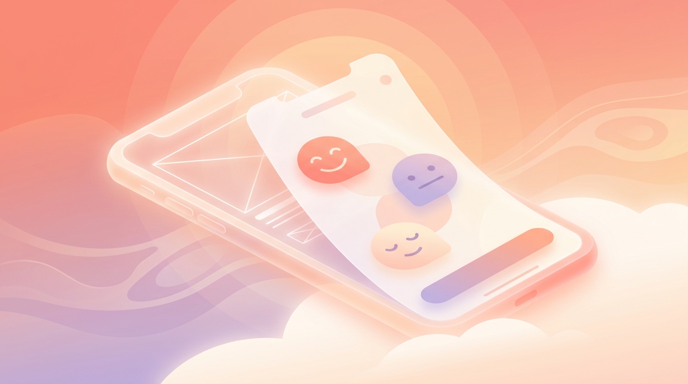
Our primary design constraint was this: logging a day must take less than 30 seconds, with zero typing required.
To achieve this, we relied heavily on gesture-based mood logging. You open the app, swipe to select one of five moods (Great, Good, Okay, Low, Rough), tap a few emojis to represent your activities or feelings, and you're done. When we designed our iOS widgets, we prioritized a two-second interaction so you wouldn't even need to open the main app to log a quick emotional shift.
We also had to tackle "Goals." Traditional apps use traffic-light progress UIs and panic-inducing notifications. Our Focus module (Routines + Todos) is entirely different.
- Routines are things you want to notice and keep up (e.g., "Drink Water"). They keep a gentle personal-best count. There are NO pressure-style streaks, NO completion percentages, and NO broken-streak guilt.
- Todos are simple daily items you strike through. They have no streak at all.
We give users up to 3 Routines and 5 Todos on our Free tier (which also includes unlimited mood/emoji logging, a 3-month calendar archive, and our weekly Mirror pattern discovery). For users who want more capacity, our Premium tier is a straightforward $2.99/mo or $11.99/yr. No hidden fees, no paywalling the core mood experience.
!Low stimulation UX showing a simple emoji logging screen
What We Killed: The Infinite "Insights" Feed
Readers of this blog love seeing the road not taken, so here is a feature we spent four weeks building and then completely killed before launch: The Daily Insights Feed.
Originally, we thought users would want AI to analyze their mood every single day and present a scrolling feed of "insights." We ran a beta test with 500 users. The feedback was brutal.
Users told us the daily feed felt "prescriptive" and "overwhelming." It turned a simple act of logging into a chore where they felt they had to read and digest a mini-therapy session every morning.
So, we killed it. We killed passive mood tracking and infinite scrolling entirely.
Instead, we built Mirror. Mirror is our pattern discovery tool that runs weekly (Sunday mornings) or on-demand. It looks at domains like Time, Activity, People, and Focus, and simply observes. It might say, "You tend to log 'Great' moods on days you tap the 'Reading' emoji." It never diagnoses. It never prescribes. It just reflects your data back to you, once a week, so you can close the app and get on with your life.
Architecture & Privacy: Data Minimization and Opt-In AI
When you build an app that relies on personal diary data, privacy is the loudest conversation in the room.
There is a massive trend right now of apps making unrealistic privacy claims to sound secure. We don't do that, because for ViviDiary, privacy means strict de-identification, and we refuse to use marketing buzzwords to obscure our architecture.
Here is the truth about how we built it: ViviDiary's data layer is cloud-stored using Supabase. We achieve our privacy-first design through strict data minimization and de-identification, not by trapping data on your phone.
Before any of your diary text is processed by our optional AI features, it is completely de-identified. We strip out PII (Personally Identifiable Information) on our secure backend before it ever touches an LLM. You can read the deep technical dive on our privacy-first cloud architecture if you want the engineering specifics.
This architecture is exactly why our AI is strictly opt-in. The core value of ViviDiary is the 3-second mood and emoji log. The AI is just an optional helper for the days you actually want to write more deeply. It never saves or confirms anything without your review, and it never generates content without a direct conversation.
The A/B Test Results: Lower Session Time, Higher Retention
So, what happens when you actively practice designing against toxic maxxing trends?
We ran an A/B test comparing our low-friction, anti-attention onboarding (Group A) against a more traditional, gamified onboarding that prompted users to set rigid daily goals and turned on all modules by default (Group B).
- Average Session Length: Group A was 40% lower (averaging 28 seconds per log).
- Day-30 Retention: Group A was 32% higher.
- Module Activation: 65% of Group A users eventually turned on additional modules (like Voice or Focus) on their own terms by week two, proving that user-led discovery works better than forced adoption.
By demanding less of our users' time, we earned more of their trust.
What's Next
We are continuing to refine our low stimulation UX. In the coming months, we are looking at ways to make the Focus module even quieter, exploring subtle haptic feedback to replace visual notifications entirely.
Our goal remains the same: we want to be the app that sits quietly beside you. We want you to open ViviDiary, log your mood in three seconds, and then put your phone down to actually live your day.
Because the best wellness app is the one that gives you your time back.