
Nervous System Regulation App Design: ViviDiary's UX Tradeoffs
When you are in the middle of an anxiety spike, the absolute last thing you need is a push notification telling you your stress levels are 14% higher than yesterday.
Yet, this is exactly how most of the health and wellness tech industry operates. The prevailing wisdom in app design is that more data equals more awareness, and more awareness equals better health. But when we started building ViviDiary, we quickly realized that this equation breaks down completely for users dealing with burnout, anxiety, or a dysregulated nervous system.
Effective nervous system regulation app design requires a fundamental shift in how we think about user experience. It demands that we prioritize low-friction, low-demand interactions over complex, gamified data dashboards. At ViviDiary, our positioning is simple: "Your day, in moods, emojis, and patterns." We want to sit beside you like a warm companion, not stand over you like a demanding coach.
In this post, I want to pull back the curtain on some of the hardest product decisions we've made. I'll share what we built, what we killed, and why we deliberately chose to design an anti-anxiety app that asks less of you, not more.
The Dysregulation Trap: Why We Killed the Biometric Dashboard
The Problem Early in ViviDiary's development, we asked ourselves a logical question: How can we give users the most accurate picture of their daily state?
The industry standard answer is biometric integration. The thesis is that if a user can see their heart rate variability (HRV), sleep debt, and step count mapped against their mood, they can "hack" their way to better mental health.
The Approaches We Considered 1. The "All-In" Biometric Dashboard: We built an internal prototype that pulled in Apple HealthKit data, sleep scores, and screen time, displaying it on a comprehensive daily dashboard with red/yellow/green indicators. 2. The Passive Tracker: A background-only sync that didn't show the data daily, but used it to generate weekly insights (e.g., "You are 40% more likely to feel 'Rough' when you sleep under 6 hours"). 3. The Minimalist State: A completely manual, subjective input system relying solely on how the user feels they are doing, ignoring objective biometric data entirely.
What We Chose (and Why) We went with the Minimalist State. We completely killed the biometric dashboard.
Why? Because our beta testing revealed a glaring issue we call the "Dysregulation Trap." When we put the biometric dashboard in front of 50 early testers, 8 out of 10 users who self-reported high anxiety stopped opening the app within two weeks.
During user interviews, the feedback was brutal but enlightening. One user told us: "I already know I slept terribly. Seeing a giant red '34% Sleep Score' on my screen just makes my chest tight. It feels like I'm failing at resting."
Presenting objective, unchangeable data about a poor physiological state to someone who is already anxious doesn't create awareness—it creates panic. It triggers the sympathetic nervous system (fight or flight). We realized we needed to embrace anti-attention design, creating a space where the user isn't bombarded with alerts, metrics, or red numbers.
How We Built It Instead of a dashboard, we built a modular input system where Mood is the only required input. New users start with everything else turned OFF. If they want to connect HealthKit later, they can toggle on 4 specific auto-categories, but the default state is entirely manual and entirely subjective. We prioritize the user's perceived reality over their objective biometric reality.
Affect Labeling: The UX of 3-Second Emoji Logging
The Problem If we aren't relying on passive data, we need users to actively log their state. But a blank journal page is intimidating. For a dysregulated nervous system, the cognitive load required to synthesize feelings into sentences is often too high. We needed a way to facilitate low demand mood tracking.
The Approaches We Considered 1. The Blank Canvas: A traditional text-first journal prompt. 2. The Emotion Wheel: A complex, multi-tiered wheel of 50+ nuanced emotions (e.g., Plutchik's wheel). 3. The Emoji-First Approach: A fast, tap-based system using universally understood symbols.
What We Chose (and Why) We chose the Emoji-First Approach, grounded in the science of affect labeling.
Neurologically, simply naming an emotion (affect labeling) reduces activation in the amygdala (the brain's fear center) and engages the prefrontal cortex. It literally cools the brain down. But to make this accessible on a bad day, the UX has to be frictionless.
We rejected the emotion wheel because it caused analysis paralysis. Users would stare at it for a minute trying to decide if they felt "apprehensive" or "insecure."
Instead, we built a simple 5-level, name-based mood scale: Great / Good / Okay / Low / Rough.
But we also knew from previous iterations that a standard 5-emoji scale isn't expressive enough to capture the texture of a day. So, we paired the 5-level mood with 22 optional manual emoji modules (activities, weather, social interactions, etc.).
What We Learned Our metrics showed that users could complete a full check-in (Mood + Energy + Emojis) in under 30 seconds, with zero writing required. This speed is critical for affect labeling ux. It allows users to journal for nervous system regulation without it feeling like a chore. The friction is so low that even on a "Rough" day, tapping three emojis feels achievable.
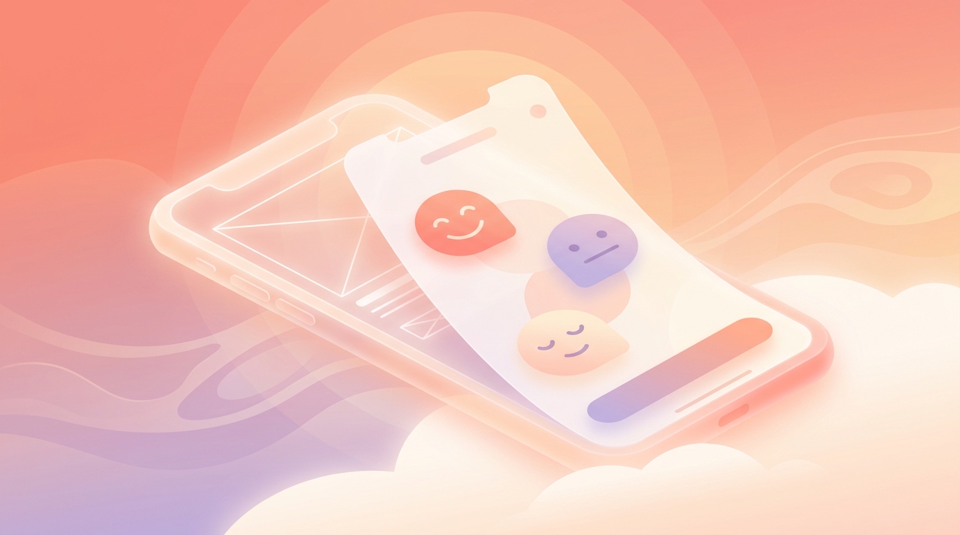
!A user tapping a 'Rough' mood emoji on the ViviDiary app, illustrating low demand mood tracking
Light Focus Routines Over Rigid Habit Trackers
The Problem Self-awareness often leads to a desire for change, which naturally brings us to habit tracking. But traditional habit trackers are engineered to exploit human psychology. They use pressure-style streaks, completion percentages, and guilt-inducing notifications ("You missed your goal today!") to drive daily active user (DAU) metrics.
For someone managing anxiety, a broken 40-day streak isn't a minor inconvenience; it's a catastrophic failure that can trigger a depressive spiral.
The Approaches We Considered 1. The Gamified Streak: Duolingo-style streaks with "streak freezes" and aggressive push notifications. 2. The Traffic Light UI: A calendar view showing green for completed days and red for missed days. 3. The Gentle Observer: A system that tracks occurrences without penalizing absences.
What We Chose (and Why) We chose the Gentle Observer approach. We explicitly killed strict streaks.
- A Routine is something you want to notice and keep up (e.g., "Drink Water"). It links to emoji categories, and ViviDiary auto-counts matching check-ins to link them to your mood patterns. It keeps a gentle "personal best" count, but there is never a pressure-style streak.
- A Todo is a simple per-day item you strike through when done. No streaks, no completion percentages.
We rejected the Traffic Light UI because user testing showed that seeing a "red" missed day on a calendar induced immediate guilt. Our Focus module is strictly opt-in (default OFF). We don't want to be your taskmaster; we want to help you notice what makes you feel good.
Why AI is Opt-In (And Our Cloud Privacy Reality)
The Problem AI is the biggest buzzword in tech right now. Investors love it, and many journaling apps are pivoting to become "AI therapists" that proactively analyze your entries and tell you how to fix your life. But when dealing with intimate emotional data, trust and privacy are the foundation of nervous system regulation. You cannot relax if you don't feel safe.
The Approaches We Considered 1. The Proactive AI Coach: An AI that reads all your entries and sends push notifications with unsolicited advice. 2. The Cloud-Stored, De-Identified Helper: Cloud storage for reliable syncing, with strict data minimization and an opt-in AI that only processes de-identified text upon user request.
What We Chose (and Why) Let's talk candidly about architecture and privacy. We take a privacy-first approach with our cloud storage, relying on strict data minimization and ensuring your diary text is completely de-identified.
We chose a privacy-first, cloud-stored approach. Why? Because our users demanded Day One-level archive trust. They want to know that if they drop their iPhone in a lake, they won't lose three years of emotional history. They want seamless iOS and Android cross-platform syncing.
So, ViviDiary's data layer is cloud-stored using Supabase.
But how do we maintain the absolute privacy required for an anti-anxiety app design? Our privacy model is built on two pillars: data minimization and strict de-identification.
Before any diary text is sent to an external AI processor, it is stripped of identifying metadata. More importantly, our AI is strictly an optional supporting tool. It is default OFF.
The core value of ViviDiary is the 3-second mood and emoji logging. The AI is just there for the days you want more depth, and the user always reviews and confirms whatever the AI drafts. We do not want an algorithm dictating their feelings. The AI does not save or confirm anything without user review, it does not provide therapy or diagnosis, and it never pressures goal achievement.
Privacy at ViviDiary doesn't come from pretending servers don't exist; it comes from rigorous de-identification before processing and ensuring the user is always the one initiating the interaction.
What's Next
Designing for nervous system regulation is an ongoing exercise in restraint. Every time we brainstorm a new feature, we have to ask ourselves: Does this add clarity, or does it add pressure?
We are currently rolling out version 1.5 of our Patterns (Mirror) feature, which presents domains like Time, Activity, People, Focus, and External factors. True to our philosophy, these patterns are presented weekly (Sunday AM) and on-demand only. There are no daily prompts. It is observation only, never prescriptive.
If you're tired of apps that make you feel like you're falling behind, we invite you to try our approach. ViviDiary is Free for all input modules, unlimited logging, a 3-month archive, and up to 3 Routines/5 Todos. For those who want deeper historical archives, Premium is $2.99/mo or $11.99/yr.
We built it to be light. We built it to be safe. And most importantly, we built it to let you breathe.