

When we first sat down to figure out how to build an AI journal app, the temptation was obvious: let the AI do everything.
We are living in an era where artificial intelligence can instantly parse thousands of words, detect subtle semantic nuances, and spit out a highly accurate sentiment analysis score. As engineers and product designers, that kind of automation is intoxicating. We wanted to build a seamless, frictionless experience where a user could just dump their thoughts into the app, and our sophisticated backend would neatly categorize their emotional state, chart it on a beautiful graph, and serve up profound psychological insights.
There was just one massive problem with this approach: users absolutely hated it.
I'm Ethan Cole, Head of Product at Vividiary, and today I want to talk about one of the most painful, yet valuable, lessons we've learned about emotion AI UX design. We learned the hard way that when it comes to people's deepest feelings, the most effective user experience isn't prescriptive. It's collaborative.
Here is the story of why we stopped telling our users how they feel, and how we redesigned Vividiary to ask them instead.
The Danger of Being Too Smart
The core tension in emotion-driven product design is the balance between intelligence and empathy.
In the early days of Vividiary's development, we assumed that reducing friction was the ultimate goal. If a user is feeling depressed, anxious, or overwhelmed, the last thing they want to do is navigate a complex UI to log their mood. We thought the "smart" thing to do was to let the user speak or type freely, and let the AI quietly work in the background to tag their emotions.
But emotions are not objective data points like heart rate or step count. They are deeply subjective, highly contextual, and incredibly personal.
When an algorithm analyzes a piece of text and declares, "You are feeling angry (87% confidence)," it crosses a line from being a helpful tool to being an invasive judge. If the AI is right, it can feel clinical and cold. But if the AI is wrong—which happens frequently when dealing with sarcasm, venting, or complex mixed emotions—it completely shatters user trust.
We realized that we were building an app that felt like a psychological diagnostic tool rather than a safe, personal diary.
What We Rejected: The Auto-Tagging Disaster
Before we landed on our current design, we tested a few different approaches. We believe in transparency at Vividiary, so I want to share the road we didn't take, because the failure of these prototypes directly informed the product you use today.
Approach 1: The "Oracle" Auto-Tagger In our first closed beta, we implemented a fully automated sentiment analysis engine. A user would write a journal entry, and upon hitting "Save," the app would instantly append tags like `#Anxious`, `#Frustrated`, or `#Joyful` based on the text.
The Pros: It was completely frictionless. The user didn't have to do any extra work.
The Cons: It was a disaster.
During user testing, 8 out of 10 users in the cohort reported feeling "misunderstood" or "annoyed" by the AI. One user gave us feedback that permanently changed our trajectory: "I wrote a long entry complaining about my boss. I was just venting to blow off steam, but the app tagged me as 'Highly Stressed' and 'Angry.' It made me feel worse, like I was failing at managing my emotions. Don't tell me I'm stressed when I'm just venting."
We realized that by auto-tagging, we were stealing the user's agency. We were writing the conclusion to their story before they had a chance to reflect on it themselves.
Approach 2: The Passive Background Analyzer Next, we tried a softer approach. Instead of slapping tags on the entry, we let the AI generate a hidden "mood score" that would only show up in the weekly analytics dashboard.
This also failed. When users eventually checked their weekly charts, they felt disconnected from the data. Because they hadn't actively participated in logging their mood, the charts felt like they belonged to someone else. It didn't prompt self-reflection; it just prompted confusion.
These failures led us to completely rethink our approach to automated mood insights UX. We needed a system that kept the user in the driver's seat.
Emotion AI UX Design That Asks, Doesn't Tell
We completely scrapped the auto-tagging engine. Instead, we shifted to a "suggest and verify" model. We decided that the AI's role in Vividiary shouldn't be to diagnose the user, but to act as a supportive companion that facilitates active reflection.
Here is what we chose to build, and why.
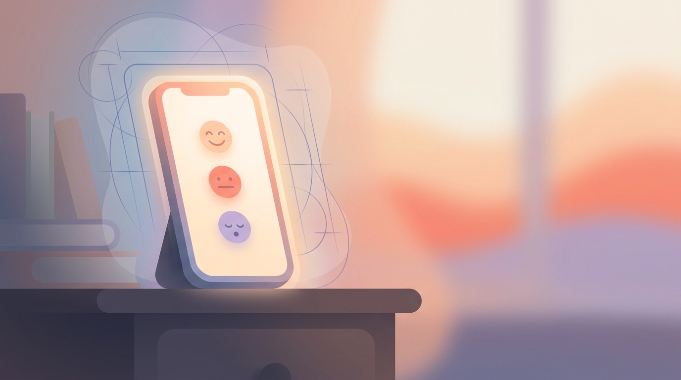
1. The Frictionless 5-Grade Mood System We still wanted to keep the initial barrier to entry incredibly low. We designed a frictionless 5-grade mood system—ranging from Best to Worst—that a user can complete in under 3 seconds upon opening the app.
This is followed by an optional emotion and activity emoji multi-select. By asking the user to manually select their baseline mood, we ground the experience in the science of affect labeling, which shows that simply putting a name to a feeling helps reduce its physiological impact.
2. Conversational AI as a Facilitator Once the baseline mood is set, users can seamlessly switch between voice and text in our AI conversation mode.
Instead of the AI quietly analyzing the user, the AI engages them. It asks open-ended questions based on their initial mood input. "I see you're feeling a bit drained today. Do you want to talk about what's taking up your energy?"
3. The "Review and Confirm" Draft System The most critical change we made was to the final output. After the conversation, the AI generates a first-person diary draft summarizing the entry.
Crucially, this draft is not saved automatically. The user is presented with the draft and must review, edit, and manually confirm it. The AI might suggest, "I felt overwhelmed by the project deadline," but the user has the power to edit that to, "I felt annoyed by the project deadline, but I got it done."
This simple UX friction—forcing the user to review and confirm—ensures that the final entry is an accurate reflection of their internal state, not an algorithmic assumption. It keeps the user firmly in control of their own narrative.
4. Soft UI and Mascot-Led Gamification To combat the "blank page" anxiety that plagues many traditional journaling apps, we introduced gentle gamification. Users are accompanied by a clay character that grows and evolves into one of 8 final forms over 30 days, based on their mood data.
This soft UI acts as an emotional guide, making the digital space feel private, welcoming, and less clinical. It turns the act of tracking mood from a sterile data-entry task into a nurturing, visually rewarding habit.
Balancing Cloud Processing with Privacy-First Design
When you build an emotion-driven product design that relies heavily on conversational AI, you inevitably run into technical and ethical hurdles regarding data privacy.
Let's be transparent about how Vividiary works under the hood. We built the app for iOS and Android using React Native and Expo. To power the complex AI interactions, generate the first-person drafts, and sync user data across devices, we rely on a robust cloud architecture utilizing Supabase and Firebase Auth.
Because we are processing highly sensitive personal diary entries, we cannot compromise on security. Vividiary is built from the ground up with a privacy-first design philosophy. Your data is encrypted both in transit and at rest in our secure cloud environment.
This architecture allows us to provide powerful AI capabilities that simply aren't feasible to run purely on a mobile device, while still ensuring that your private thoughts remain strictly confidential. We do not sell user data. We do not train external public models on your personal diaries.
To sustain this secure infrastructure and balance cloud-based AI costs with privacy, we utilize a freemium model managed via RevenueCat.
We wanted to ensure that the core benefits of mental health tracking remain accessible to everyone. Our Free tier encourages daily habit-building with unlimited mood logging, basic analytics, and 3 AI conversations per day.
For users who want deeper insights, our Premium tier ($2.99/mo or $11.99/yr) unlocks unlimited AI, voice priority, and advanced analytics like bubble charts, heatmaps, and pattern detection. By relying on a transparent subscription model rather than data monetization, we align our business incentives directly with our users' privacy and well-being.
The Data: Why Friction Isn't Always Bad
When we proposed the "suggest and verify" model—specifically the step where users have to manually review and edit their AI-generated draft before saving—there was significant pushback internally.
The conventional wisdom in product design is that every extra tap causes a drop-off. We were terrified that users would have a great conversation with the AI, get to the draft review screen, feel fatigued, and abandon the entry entirely.
We ran a split test to find out. Cohort A got the auto-save experience (zero friction). Cohort B got the review-and-confirm experience (added friction).
The results completely shattered our assumptions.
While Cohort A had a slightly faster time-to-completion, Cohort B showed a massive improvement in our long-term retention metrics.
Users who were forced to review and edit their AI-generated drafts had a 42% higher 30-day retention rate than those who had their entries auto-saved. Furthermore, the self-reported "trust score" in our post-test surveys was nearly twice as high for Cohort B.
Why? Because friction isn't always bad. When dealing with personal thoughts, a small amount of friction signals care, accuracy, and control. By asking the user to confirm the draft, we were essentially saying, "This is your mind, not ours. Did we get this right?"
That moment of active reflection is where the actual therapeutic value of journaling happens. The AI does the heavy lifting of organizing the thoughts, but the user retains the psychological ownership of the emotion.
What's Next
We are constantly refining our emotion AI UX design. Right now, the engineering and design teams are working on expanding the clay character evolutions to better reflect long-term emotional resilience, rather than just day-to-day mood swings.
We are also fine-tuning our voice priority mode for premium users, ensuring that the AI conversational flow feels even more natural and less like a rigid interview.
Building an AI journal app is a humbling experience. It requires you to constantly check your ego as a product builder and remember that technology should serve human psychology, not the other way around. By shifting from an AI that tells you how you feel, to an AI that helps you discover how you feel, we've built a product that users actually trust with their innermost thoughts.
And in this space, trust is the only metric that truly matters.