The fastest way to kill user trust in a journaling app isn't a clunky interface or a slow load time. It's the sudden, heart-stopping panic a user feels when they hand their unlocked phone to a friend to show a photo, and a highly personal diary entry flashes on the screen.
When we set out to build ViviDiary, our core positioning was simple: "Your day, in moods, emojis, and patterns." We wanted to create a space that felt as lightweight as Dailybean but offered the pattern discovery of Bearable. We optimized relentlessly for speed, getting the core check-in time—mood, energy, and emojis—under 30 seconds with zero writing required.
But speed and security are often at war in product design. If you make an app too easy to open, it's vulnerable. If you lock it down like a banking app, users will abandon their daily logging habit because of the friction.
Here is an inside look at how we navigated this tradeoff, why we prioritized a privacy-first, de-identified cloud approach, and how we designed a lock screen hidden app UX for private diaries that actually works.
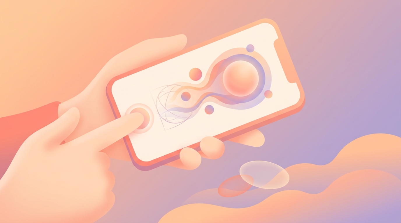
!A user holding a smartphone showing the ViviDiary FaceID lock screen interface
We needed to build a security layer that felt invisible until the exact moment it was needed. (Alt: lock screen hidden app ux for private diaries)
The "Hand-the-Phone" Anxiety
In our early beta testing, we noticed a strange behavioral pattern. About 22% of our most active users were force-closing the app immediately after logging their mood, rather than letting it sit in the background.
When we conducted user interviews to find out why, the answer was unanimous: anxiety.
Users were terrified of the iOS app switcher. If ViviDiary was left open in the background, anyone swiping through their open apps could read their latest memo or see that they logged a "Rough" mood and tagged it with the "Family" and "Anxiety" emojis.
Diary data is hyper-personal. When users look at private journal apps, their primary concern isn't usually state-sponsored hackers; it's their roommate, their partner, or their coworker. They need a boundary.
We realized that if ViviDiary was going to be a true safe space, we couldn't just rely on the OS-level device lock. We needed application-level security that didn't compromise our sub-30-second logging goal.
Integrating Lock Screen Hidden App UX for Private Diaries
To solve this, we had to design a seamless biometric handoff. We looked at how banking apps handle security, but their approach was too heavy-handed for a mood tracker.
The Approaches We Considered
- The PIN Pad (Rejected): We initially prototyped a standard 4-digit PIN pad that appeared every time the app opened. It was a disaster. User testing showed a 40% drop in daily check-ins. Typing a PIN added 3-5 seconds to a 30-second flow, which ruined the lightweight feel.
- The Deep-Menu Toggle (Rejected): We considered making the app lock a buried setting that users had to manually activate. However, privacy shouldn't be a premium feature you have to hunt for.
- The Biometric Blur (Chosen): We opted for a native lock screen hidden app UX for private diaries that leverages Face ID (iOS) and Biometric Prompt (Android) combined with an instant UI blur state.
How We Built It
We implemented a listener for the app's lifecycle states. The absolute millisecond ViviDiary moves from the `active` state to the `inactive` or `background` state, we overlay a Gaussian blur on the app's root view.
If you swipe up to view your open apps, ViviDiary is completely illegible. It just looks like a soft, colorful gradient.
When you tap back into the app, it immediately calls the native biometric authentication. Because modern Face ID and fingerprint scanners authenticate in fractions of a second, the user barely notices the lock. They tap the app, look at their phone, and they're in. The friction is near zero, but the security is absolute.
We also had to rethink our iOS UX design for widgets. We designed our home screen widgets to only show aggregate, non-sensitive data (like a simple color gradient representing the week) rather than specific text or sensitive emojis, ensuring that a glance at the home screen doesn't betray your privacy.
What We Embraced: Privacy-First De-Identification
When discussing privacy, we have to address the elephant in the room. Many competing apps make big promises, but we focus on strict data minimization and ensuring your diary text is completely de-identified.
We explicitly rejected this architecture.
Why? Because while offline-only storage sounds fantastic in a marketing brochure, it is a nightmare in reality. I have seen too many heartbreaking support tickets from users of other apps who dropped their phone in a lake, or had it stolen, and lost three years of daily reflections because they forgot to manually configure an iCloud backup.
Day One set the industry standard for archive trust, and we believe users deserve that same peace of mind. Therefore, ViviDiary's data layer is cloud-stored using Supabase.
Our privacy comes from data minimization and de-identification, not from keeping data trapped on a fragile piece of glass in your pocket.
When we were designing our privacy-first cloud architecture, we established a strict rule: any diary text is de-identified before any external or AI processing occurs. We separate your identity from your data.
This means you get the reliability of seamless cross-device syncing and the safety of a cloud backup, without sacrificing confidentiality. We chose de-identified cloud processing because it allows us to provide a robust, reliable service while protecting your privacy through strict data minimization, ensuring your text is stripped of personal identifiers before any external AI analysis.
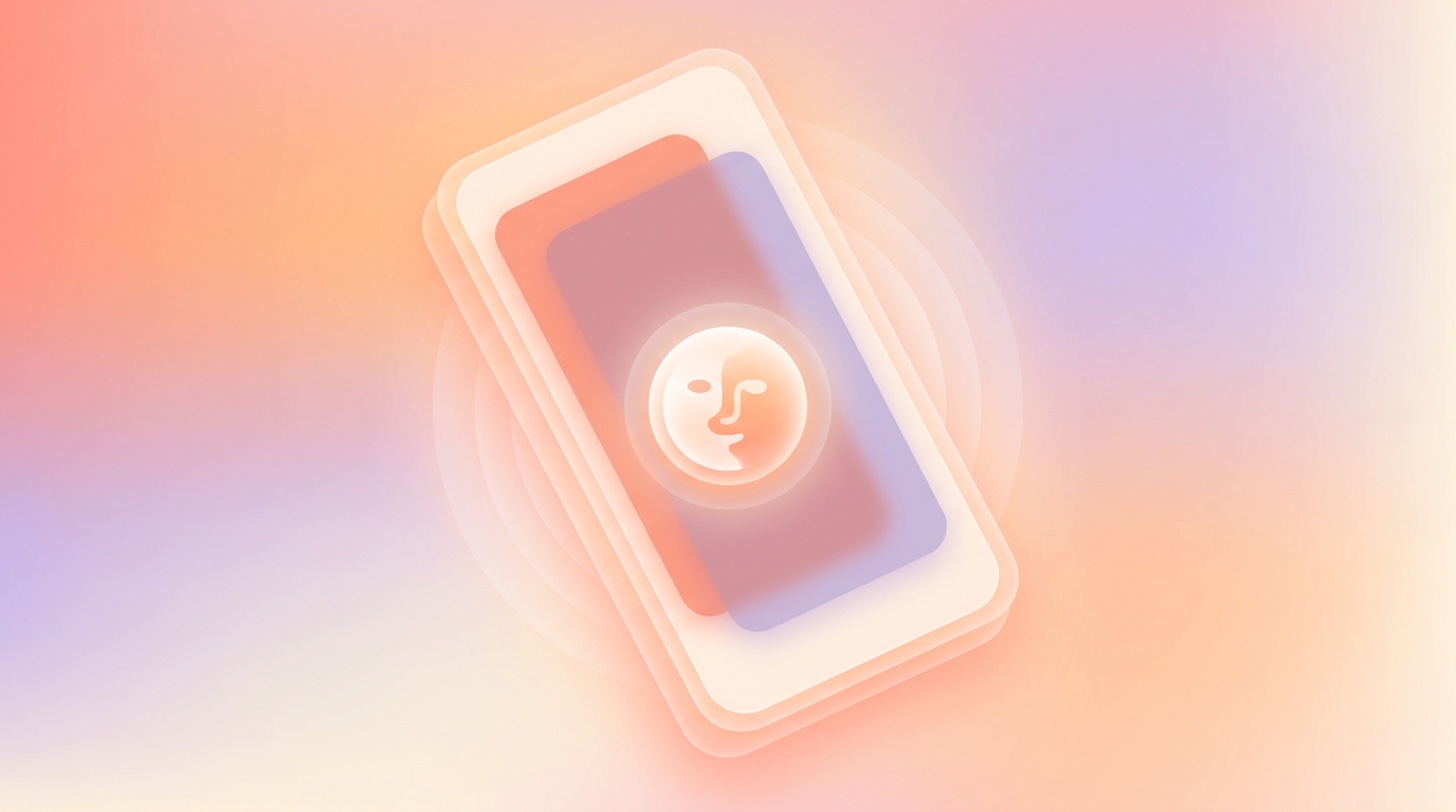
!A technical diagram sketched on a whiteboard showing data de-identification before cloud storage
We chose cloud storage via Supabase with strict de-identification, focusing on privacy-first data minimization. (Alt: cloud architecture data de-identification process)
Why Our AI is Strictly Opt-In
Because we handle sensitive mood and life tracking data, users often ask us: are AI journals safe?
Our answer is that AI should never be the core mechanic of a private diary; it should only ever be an optional tool.
ViviDiary is a modular app. When a new user downloads the app, the only required input is a 5-level mood (Great, Good, Okay, Low, Rough). Everything else—the memo, the voice input, the Focus module (Routines and Todos), and the 22 manual emoji categories—is toggled OFF by default.
We don't force you to write, and we certainly don't force you to talk to an AI.
Our AI is strictly an opt-in helper for the days you want more depth. If you choose to use it, your text is de-identified before processing. The AI does not save or confirm anything without your explicit review. It does not provide therapy, diagnosis, or prescription. It simply acts as a sounding board.
This ties directly back to our privacy philosophy. By minimizing the data we collect (data minimization) and keeping the core experience focused on a 3-second mood and emoji log, we drastically reduce the privacy footprint of the user.
User Testing: The Impact of Notification Suppression
The final piece of the hidden app UX puzzle was notifications.
Initially, we had a standard notification system. If you set a Todo in our Focus module (which is entirely opt-in and limited to 5 per day on the Free tier), the app would remind you.
But we realized that lock screen notifications are a massive privacy leak. If you have a Todo that says "Talk to therapist about burnout," you do not want that flashing on your lock screen while your phone is sitting on a conference room table.
Furthermore, we strongly oppose pressure-style streaks. We never use panic notifications, streak-freeze mechanics, broken-streak guilt, or traffic-light progress UIs. A Routine in ViviDiary is something you want to notice and keep up—a gentle personal-best count—not a quota that punishes you for missing a day.
- No Guilt Prompts: We killed all "you missed today" notifications.
- Generic Masking: For users who opt into reminders, the lock screen notification is deliberately vague. It simply says "ViviDiary: Time for your daily check-in" rather than displaying specific user data or missed routines.
What We Learned
When we rolled out the biometric blur and the suppressed notification system, the results surprised us.
We expected a slight dip in engagement due to the added (albeit small) friction of Face ID. Instead, we saw a 14% increase in D30 retention (Day 30 retention).
When we followed up with users, they explained that because they no longer feared leaving the app open or having a sensitive notification pop up, they felt more comfortable using ViviDiary throughout the day. The app had become a safe, cozy boundary.
We also saw a significant uptick in users utilizing the Free tier's unlimited mood and emoji logging multiple times a day, simply because they knew the app switcher wouldn't betray them. (As a quick note on our model: all input modules, unlimited logging, a 3-month archive, and up to 3 Routines / 5 Todos are completely Free. For users who want deeper historical patterns, Premium is $2.99/mo or $11.99/yr).
What's Next
Privacy is not a feature you build once and check off a list; it is an ongoing posture.
Currently, we are refining how the biometric lock interacts with Apple's new iOS 18 native hidden folders. We want to ensure that if a user utilizes Apple's OS-level app hiding, ViviDiary's internal state management respects that without causing double-authentication loops.
We are also continuing to refine our de-identification algorithms before data hits Supabase, ensuring that as our optional AI helper gets smarter, our data minimization gets stricter.
Ultimately, a diary is only as useful as it is honest. And users can only be honest if they feel entirely, unapologetically safe. By prioritizing a hidden app UX and transparent cloud architecture over marketing buzzwords, we're building a tracker that actually deserves your trust.