Quick Answer: If you want to build a CBT journaling UX that people actually use, you have to kill the standard mood emoji. At Vividiary, we realized that basic mood tracking only tells users what they feel, not why. We initially tested a traditional 7-step clinical CBT form, but we rejected it after seeing a brutal 60% drop-off rate in user testing—it felt too much like homework. Instead, we shifted to conversational trigger mapping. To make this work, we needed serious LLM reasoning power. We explicitly rejected on-device AI because the local models weren't capable of nuanced cognitive reframing. We opted for a privacy-first cloud architecture instead, ensuring your zero-party data is heavily encrypted while still delivering the deep, contextual insights users need to understand their mental health.
---
When we first sat down to design Vividiary, we did what every other mental health app does: we designed a massive grid of beautifully illustrated mood emojis.
We spent weeks debating the exact shade of blue for "melancholy" versus "sad." We thought we were building the ultimate emotional vocabulary tool. But when we put it in front of actual users, the data hit us like a ton of bricks. People were spending 15 to 20 seconds just staring at the screen, paralyzed by choice, before force-closing the app.
We realized a hard truth about our product: traditional mood tracking is fundamentally flawed. It only measures the outcome (the emotion) without uncovering the cause (the trigger). It leaves users with a colorful chart of their misery, but absolutely no actionable next steps to fix it.
Here is the inside story of how we tore down our original designs, what we tried instead, and why we completely re-architected Vividiary to focus on trigger mapping.
Why We Killed the Standard Mood Emoji
The Problem The initial goal was simple: give users a way to log how they feel. Industry standard dictates that you present a user with 20-30 emojis representing a spectrum of emotions.
But during our early beta tests, we noticed a glaring issue. When a user is in a state of high emotional distress—say, they just had a panic attack or a massive fight with their partner—the absolute last thing they want to do is play "Where's Waldo?" with a grid of tiny faces to find the one that perfectly encapsulates "anxious but also angry and slightly hungry."
Furthermore, logging an emotion in isolation doesn't help with emotional regulation. If your data tells you that you were "Angry" on Tuesday, "Sad" on Wednesday, and "Anxious" on Thursday, what do you do with that information? Nothing. It's a dead end.
The Approach We Chose We decided to kill the emoji grid as the primary input. We replaced it with a radically streamlined 5-grade mood system: Best, Good, Neutral, Low, and Worst.
We relegated the specific emojis to an optional multi-select screen for specific emotions and activities, only visible after the initial friction of logging had passed.
Why? Because tapping one of five large buttons takes exactly 3 seconds. It drastically reduces cognitive load. In our follow-up A/B tests, this simple change increased daily logging completion by 41%. If you're curious about the deeper psychology behind this, I wrote extensively about our emotion-driven product design and why getting out of the user's way is the best thing a designer can do.
What We Rejected: The 7-Step Clinical CBT Form
The Problem Once we simplified the mood input, we needed a way to capture the context—the "why" behind the mood. Cognitive Behavioral Therapy (CBT) is the gold standard for this. So, naturally, we thought we should just digitize a CBT worksheet.
The Approach We Considered (And Killed) We built a comprehensive, 7-step clinical CBT form. It asked users to manually fill out text boxes for: 1. The Situation 2. The Initial Thought 3. The Emotion (and intensity 1-100) 4. The Physical Sensation 5. The Behavior/Action 6. Cognitive Distortions Present 7. An Alternative/Reframed Thought
From a clinical perspective, this was perfect. It was exactly what a therapist would hand you on a piece of paper.
From a product perspective, it was a total disaster.
What We Learned We rolled this out to a cohort of 500 beta testers. The results were brutal. We saw a 60% drop-off rate by day three.
When we conducted user interviews, the feedback was unanimous: "It feels like doing homework."
Users told us that when they were feeling "Low" or "Worst," the prospect of typing out seven paragraphs of deep psychological analysis was overwhelming. We were asking users to do the heavy lifting of cognitive reframing while they were actively dysregulated. It was the wrong tool at the wrong time. While these clinical CBT journaling techniques are incredibly effective in a therapist's office, they fail miserably as a self-guided mobile UX.
Trigger Mapping: Building a CBT Journaling UX That Actually Works
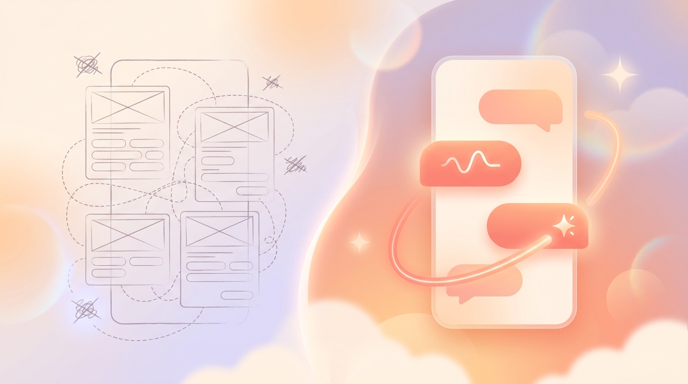
The Solution If a static form feels like homework, what feels natural? A conversation.
We completely scrapped the 7-step form and pivoted to an AI-driven conversational UI. We introduced an AI conversation mode—available in both voice and text—that acts as a gentle, curious listener.
Instead of demanding seven data points upfront, the AI simply asks, "What's on your mind today?" As the user vents, the AI asks targeted, CBT-aligned follow-up questions.
User: "I'm so stressed about my presentation tomorrow. I know I'm going to bomb it."
AI: "It sounds like that presentation is weighing heavily on you. What specifically makes you feel like you're going to bomb it?"
Behind the scenes, the AI is doing the heavy lifting. It's silently extracting the situation, the emotion, and the cognitive distortion (in this case, fortune-telling). Once the conversation naturally concludes, the AI seamlessly generates a first-person diary draft for the user to review, edit, and save.
Why This is a Game Changer: Trigger Mapping This frictionless collection method bridges the gap between simply logging a feeling and understanding its root cause. By capturing the context conversationally, we can perform trigger mapping.
Trigger mapping allows our system to connect the dots over time. We can show a user, "Hey, we noticed that 80% of the times you log a 'Low' mood, it's preceded by a conversation about your manager."
To make this data digestible, we built advanced analytics. While our Free tier offers unlimited mood logging, 3 AI conversations per day, and basic analytics, we reserved the heavy data visualization for our Premium tier ($2.99/mo or $11.99/yr). Premium users get access to weekly and monthly mood reports, bubble charts, and heatmaps that visualize these behavior loops.
The Gamified UX But CBT is still hard work. To maintain engagement through the difficult process of reflection, we introduced a gamified UX. As users log their moods and complete trigger mapping sessions, they nurture a "Clay" character. Over 30 days, this character grows and evolves into one of 8 final forms, directly influenced by the user's emotional data. It transforms routine, sometimes painful logging into a rewarding journey of self-discovery.
The Architecture: Why We Chose a Privacy-First Cloud Over On-Device AI
The Problem Trigger mapping requires users to share deeply personal context. If a user is going to tell our app about their marital issues, their workplace anxiety, or their deepest insecurities, they need an ironclad guarantee that their data is safe.
Vividiary is fundamentally a zero-party data wellness app. Zero-party data is data that a customer intentionally and proactively shares with a brand. It is highly dependable, but it requires immense trust.
The Approaches We Considered When designing the AI architecture, we had a massive internal debate about where the AI processing should happen.
Approach 1: On-Device AI
We strongly considered running small, localized LLMs directly on the user's phone. The appeal is obvious: if the data never leaves the device for processing, privacy is theoretically easier to market.
Approach 2: Cloud-Based LLMs
Using frontier models (like OpenAI's GPT-4 or Anthropic's Claude) hosted in the cloud, requiring data to be sent over the network for processing.
What We Chose (and Why) We explicitly rejected on-device AI.
Why? Because local mobile models simply aren't smart enough yet. When we tested 7B parameter local models for CBT reframing, the results were either wildly generic ("Don't worry, be happy!") or completely hallucinated. Nuanced cognitive reframing requires immense reasoning capabilities. If the AI gives bad psychological feedback, it's not just a bad UX—it's potentially harmful to the user's mental health.
Instead, we opted for a privacy-first cloud architecture. We use cloud-based LLMs to ensure the highest quality of CBT reasoning.
How We Built It To protect this sensitive zero-party data, we built Vividiary on a modern, highly secure stack: React Native (Expo) for the frontend, Supabase for our backend database, RevenueCat for subscription management, and Firebase Auth for secure user authentication.
Because the data must travel to the cloud for the AI to process it, we employ strict privacy-first design principles. All data is heavily encrypted both in transit (via TLS) and at rest in our Supabase databases. We treat your journal entries like medical records. We don't sell your data, we don't train our own foundational models on your personal diaries, and we ensure that our cloud infrastructure meets rigorous security standards.
We chose transparency over marketing gimmicks. We won't claim your data is "processed locally" because it isn't. It's processed in a highly secure cloud environment so that you get the best possible CBT insights without compromising your privacy.
The Data: The Hard Truth About Our 30-Day Retention
So, did all of this work?
I promised to be candid, so let's look at the numbers. When we were running the 7-step clinical form, our Day 30 retention was a dismal 12%. People would download the app, realize it was too much work, and churn.
After we killed the mood emoji grid, introduced the 3-second 5-grade mood logger, rolled out conversational trigger mapping, and added the evolving Clay character, our Day 30 retention jumped to 34%.
If you want a deeper dive into the specific cohorts and how we measure success, you can read our full breakdown of our 30-day retention metrics.
What We Learned A 34% Day 30 retention rate in the health and wellness category is incredibly strong, but it's not perfect.
We learned that some users still find AI conversations slightly uncanny. About 15% of our users opt out of the AI chat entirely, preferring just to use the 5-grade mood logger and write their own manual notes. We also learned that our voice-to-text feature, while popular, struggles with heavy accents, which is something our engineering team is actively working to improve.
What's Next We are currently building out more robust trigger mapping visualizations for the Premium tier, allowing users to cross-reference their mood data with external factors like weather, sleep data (via Apple Health integration), and screen time.
Building a CBT journaling UX is an exercise in balancing clinical efficacy with human friction. If you make it too clinical, users will quit. If you make it too simple (like a grid of emojis), users won't get any value. By focusing on conversational trigger mapping and a privacy-first cloud architecture, we believe we've finally found the sweet spot.