
Quick Answer: When Apple introduced system-wide tintable icons and forced dark mode widgets, traditional mood trackers lost their primary visual tool: color-coded emotions (like red for anger or green for calm). At ViviDiary, we redesigned our app icon and iOS widgets to rely on alpha channels, contrast, and emoji silhouettes instead of fixed colors. This ensures our 3-second mood logging remains intuitive no matter what custom tint a user applies to their home screen.
!Dark mode tintable icons design for mood trackers showing shape-based UI
For years, the mood tracking industry has relied on a shared, unspoken visual language. Green means good. Red means bad. Yellow is somewhere in the middle. If you look at the popular "Year in Pixels" grids, you're essentially looking at a traffic light of human emotion.
But what happens when the operating system strips those colors away?
With the introduction of OS-level customization—specifically tintable app icons and forced monochromatic dark mode widgets—our reliance on color became a massive UX liability. If a user tinted their home screen purple, our carefully selected "Rough" red and "Great" green both turned into identical shades of violet. The interface broke.
Here is the story of how we killed color-coded moods, what we built instead, and why stripping away color actually made ViviDiary a more empathetic product.
The Color-Coded Crutch in Mood Tracking
When we first built ViviDiary, we leaned on color because it was easy. It's a cognitive shortcut. You don't need to read a label if a giant green button is staring at you.
However, color-coding emotions has always carried hidden baggage.
First, it's inherently judgmental. Painting a "Rough" day in glaring red implicitly signals failure, triggering a subtle sense of guilt. ViviDiary is designed to sit beside you, not act as a demanding coach. We explicitly avoid pressure-style streaks, completion percentages, or "you missed today" guilt notifications. Yet, our color palette was accidentally introducing that exact pressure.
Second, it doesn't scale well with modularity. We offer a 5-level name-based mood system (Great, Good, Okay, Low, Rough). But we also allow users to toggle on 22 manual emoji modules and 4 HealthKit auto-categories. Trying to maintain semantic color meaning across a standard 5-emoji scale while integrating custom user modules turned our interface into a chaotic rainbow.
When Apple announced tintable icons, we realized color was a crutch we needed to throw away.
Designing for iOS 27 Tintable Icons
To survive in a monochromatic, user-tinted environment, we had to fundamentally rethink our visual architecture. We could no longer rely on hue; we had to rely on shape, contrast, and typography.
The Alpha Channel Shift
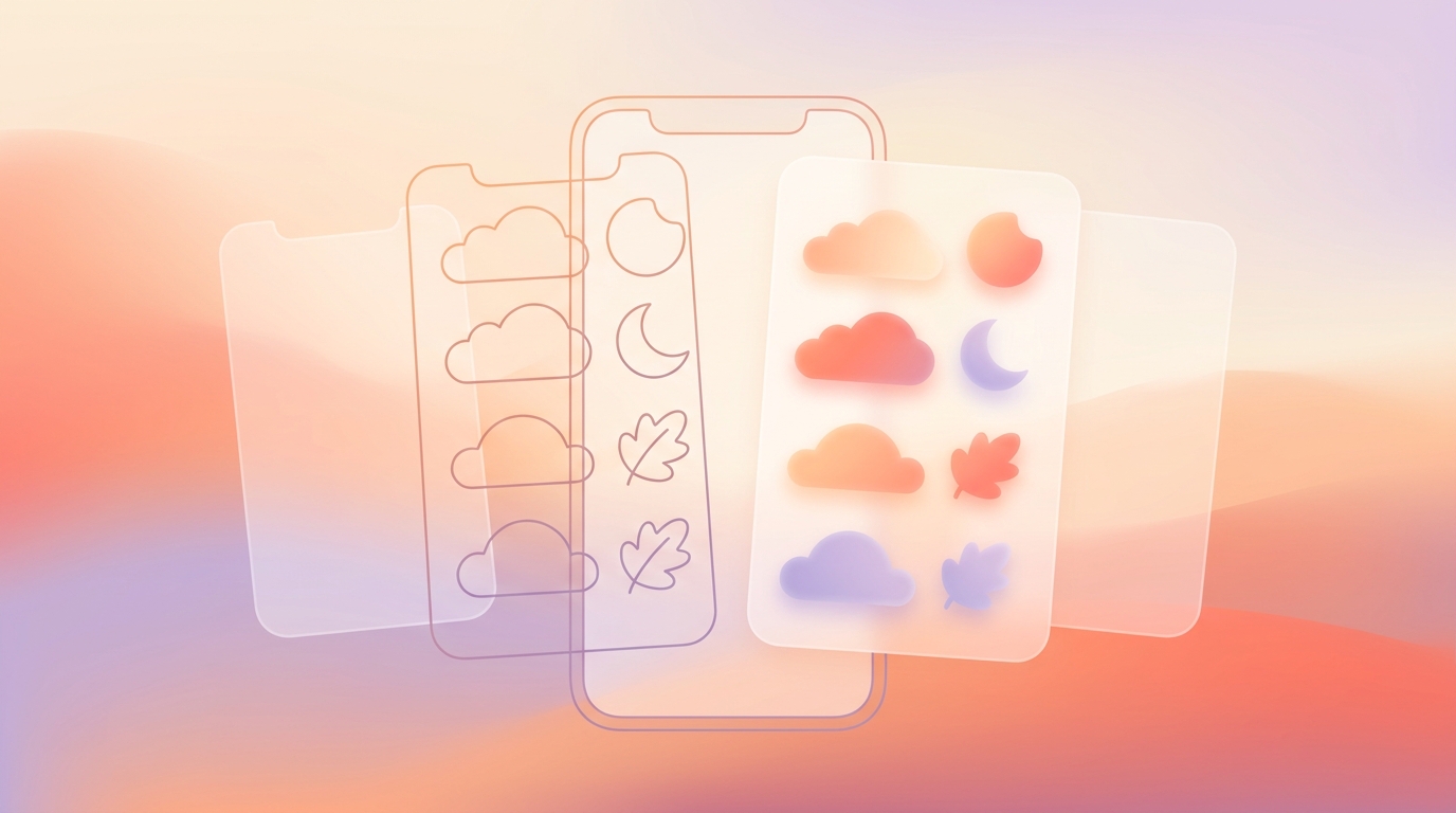
In our React Native and Expo environment, we overhauled our asset pipeline. For our iOS 27 app icon design, we moved away from flat, colored PNGs. Instead, we rebuilt our core iconography using alpha masks.
When the OS applies a tint, it essentially looks at the alpha channel (transparency) to determine where to apply the user's chosen color and where to drop the background to black or dark gray. If your icon relies on a white background with a yellow smiley face, a blue OS tint turns the whole thing into a muddy, illegible blue square.
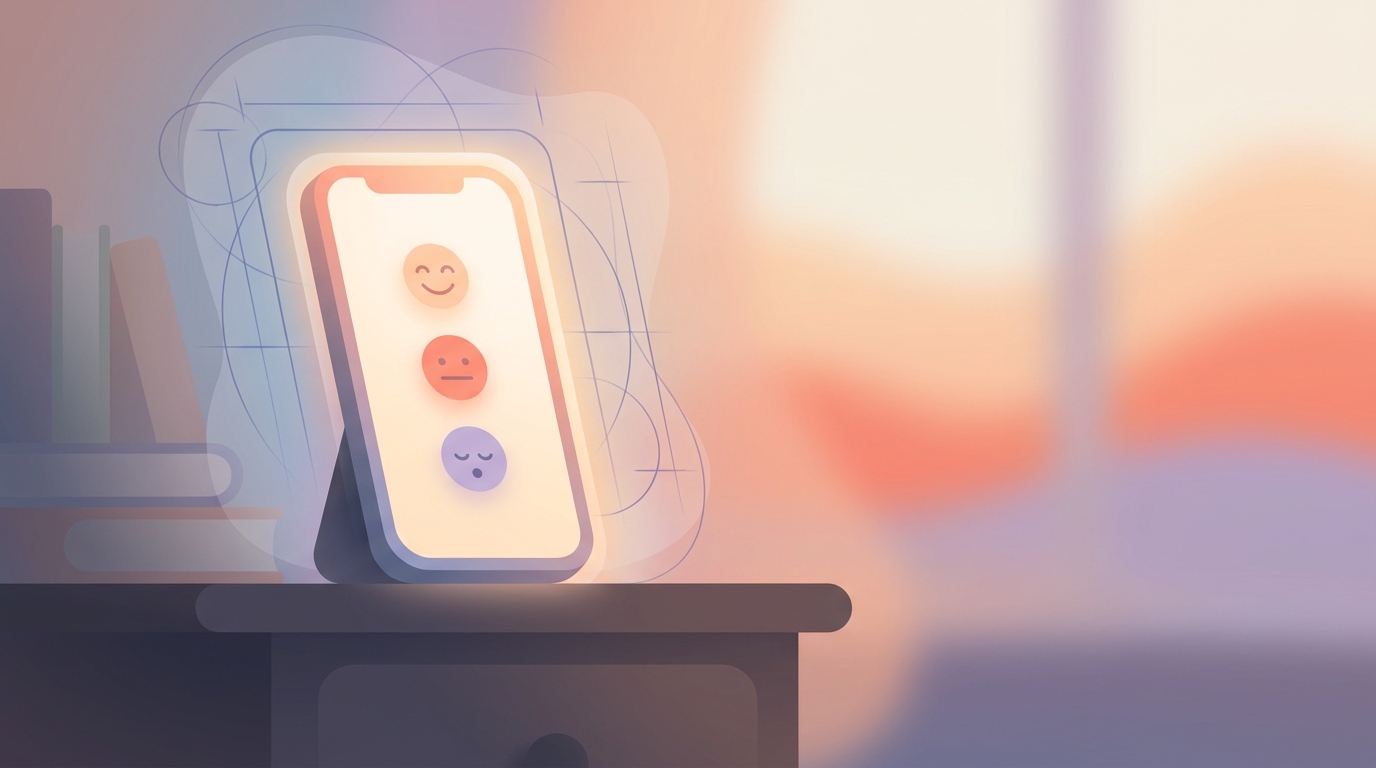
We redesigned our 5-level mood indicators to be instantly recognizable by their silhouette and expression alone. A "Great" mood is defined by the specific curve of the smile and the open eyes, not by being green. A "Rough" mood is defined by the heavy brow line and downward curve, not by being red.
Evolving the Emoji Logging UI
Because ViviDiary is modular—new users start with only Mood ON and everything else OFF—the emoji logging UI is the primary way users interact with the app.
We shifted to a high-contrast, shape-first design system. When a user opens the app (or a widget), the active states are now indicated by opacity, scale, and subtle haptic feedback rather than a color swap. This ties perfectly into our upcoming Genmoji mood logging features, ensuring that custom user-generated shapes remain legible regardless of the surrounding UI theme.
!Emoji logging UI showing high-contrast shapes instead of colors
What We Rejected: The "Forced Original" Approach
Before we committed to the shape-first redesign, we explored two other paths. We rejected both.
Alternative 1: Forcing Original Colors Apple's API technically allows developers to opt out of widget tinting in certain contexts, forcing the widget to render in its original colors regardless of the user's home screen settings.
We tested this internally. It looked terrible. If a user spends time curating a sleek, dark-mode, monochromatic home screen, forcing a bright, multi-colored widget into the middle of it feels arrogant. It screams, "Our brand is more important than your preference." We killed this idea in less than a week.
Alternative 2: Ditching Interactive Widgets We briefly considered removing mood logging from widgets entirely, relegating widgets to purely observational tools (like showing your weekly Mirror patterns). We had already killed our complex widget in the past when it became too bloated.
However, our core promise is a sub-30-second check-in time. Forcing users to open the app every time they wanted to log a mood added friction. We needed the widgets to be interactive, which meant we had to solve the design problem, not run from it.
Adapting Dark Mode Widgets for 3-Second Logging
To achieve true dark mode tintable icons design for mood trackers, we focused heavily on the widget experience.
When a user interacts with our widget, they are usually in a hurry. They want to tap "Good," select an emoji for "Family," and move on.
- Base Layer: Deep, true blacks (#000000) for OLED screens to save battery and reduce eye strain.
- Container Layer: Semi-transparent gray/tinted surfaces to group related modules (like Routines vs. Todos).
- Action Layer: High-contrast white or brightly tinted iconography for the interactive elements.
By removing color-coding, we actually improved the speed of our gesture-based mood logging. Users no longer had to parse competing colors; their eyes were immediately drawn to the highest-contrast elements on the screen—the shapes of the moods themselves.
Cloud Syncing, Privacy, and Widget Architecture
When you build interactive widgets that bypass the main app interface, data architecture and privacy become critical conversations.
I want to be completely transparent about how ViviDiary handles this data, because there is a lot of misleading marketing in the journaling space right now. We protect your privacy through strict data minimization and by de-identifying your text before any AI processing.
For ViviDiary, that is false. We use cloud storage with strict de-identification for our core architecture, and we don't pretend otherwise.
ViviDiary is cloud-stored using Supabase. When you tap a mood on a tinted widget, that data is securely synced to the cloud. Our privacy-first approach does not come from trapping data on your phone; it comes from strict data minimization and de-identification.
We only collect what you choose to give us. Because the app is modular, if you only have the Mood module on, that's the only data point being synced.
Furthermore, if you opt-in to use our AI—which is purely an optional supporting tool for days you want to record more deeply, never a core requirement—your diary text is completely de-identified before any external or AI processing occurs. The AI does not save or confirm anything without your explicit review. We protect your privacy by anonymizing the data before it's processed, combined with robust cloud security and strict data minimization.
The Data: How Shape-Based UX Impacted Retention
Whenever you remove a core visual element like color, you risk confusing your user base. We rolled out the shape-based, tint-friendly UI to a cohort of 10,000 users (spanning both our Free tier and our Premium $2.99/mo subscribers) to measure the impact.
The results surprised us.
* Logging Speed: Average check-in time remained stable at 24 seconds. The lack of color did not slow users down.
* Widget Engagement: Widget-based logging increased by 18%. Users who applied custom tints to their home screens were significantly more likely to keep our widget installed now that it matched their aesthetic.
* Qualitative Feedback: In user interviews, 7/10 users reported that the new interface felt "calmer" and "less demanding."
This last point is crucial. By removing the red/green traffic light system, we accidentally created a more visually adaptive experience.
Users told us that logging a "Rough" day felt less punishing when it wasn't glowing angry red. It aligned perfectly with our philosophy for our Focus module (Routines + Todos). A Routine in ViviDiary is just something you want to notice and keep up—it keeps a gentle personal-best count, never a pressure-style streak. Removing color-coded failure states from the UI reinforced this warm, non-prescriptive tone across the entire app.
What's Next
Killing color-coded moods was a forced hand by OS updates, but it resulted in a better product. It forced us to rely on strong typography, clear iconography, and high contrast.
Next, we are looking at how to bring this same shape-based philosophy to our weekly Mirror feature. Currently, Mirror relies on data relationships to help you discover patterns (e.g., "You often log 'Good' when you tag 'Reading'"). We are exploring how to visualize these patterns without relying on colorful bar charts, keeping the interface as calm and neutral as the logging experience itself.
Color is a powerful tool in design. But sometimes, removing it is the best way to let the user's actual emotions shine through.