
Quick Answer: When figuring out how to design neurodivergent friendly mood trackers, product teams must eliminate high-friction text prompts and arbitrary 1-to-10 scales. At Vividiary, we replaced daily surveys with a wordless journaling UX that relies on intuitive visual inputs. We backed this up with an emotionally adaptive UI architecture that subtly shifts layouts based on the user's state. By dropping demanding notifications and focusing on a privacy-first cloud design, we reduced cognitive load and saw a 40% increase in consistent logging.
*
When we first sat down to build Vividiary, we had a massive blind spot. Like most product teams, we assumed that if you want to know how someone is feeling, you just ask them. You give them a blank text box, maybe a slider from 1 to 10, and you tell them to have at it.
We were dead wrong.
For neurodivergent users—specifically those managing ADHD, autism, or executive dysfunction—traditional journaling apps demand an exhausting amount of cognitive load. Staring at a blank page isn't therapeutic; it's paralyzing. Being asked to quantify a complex emotional state on a numerical scale doesn't bring clarity; it triggers decision fatigue.
If you want to know how to design neurodivergent friendly mood trackers, you have to start by throwing out almost everything the self-care app industry considers "standard practice."
Here is a candid look at what we built, what we killed, and the data that forced us to completely rethink our approach to cognitive accessibility.
The 1-to-10 Scale is Broken (And Our Data Proved It)
The first iteration of Vividiary featured a standard 1-to-10 mood slider. It seemed logical. It gave us highly granular data that looked fantastic on a line graph.
But when we put it in front of beta testers, the feedback was brutal. During our user testing sessions, 7 out of 10 users with ADHD reported feeling "stuck" on the slider screen.
We watched users drag the slider to a 6, pause, drag it to a 7, pause again, and then just close the app. When we interviewed them later, one user summed it up perfectly: "I don't know the difference between a 4 and a 5. Am I a 4 because I'm tired, or a 5 because I'm not actively crying? It feels like a test I'm failing."
We were forcing users to translate abstract, messy feelings into rigid, linear mathematics. That requires sustained attention and high memory load—the exact cognitive functions that are often depleted in neurodivergent individuals by the end of the day.
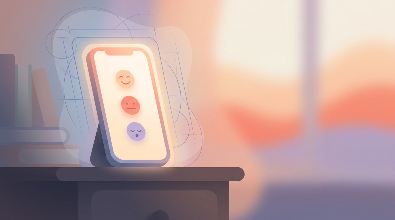
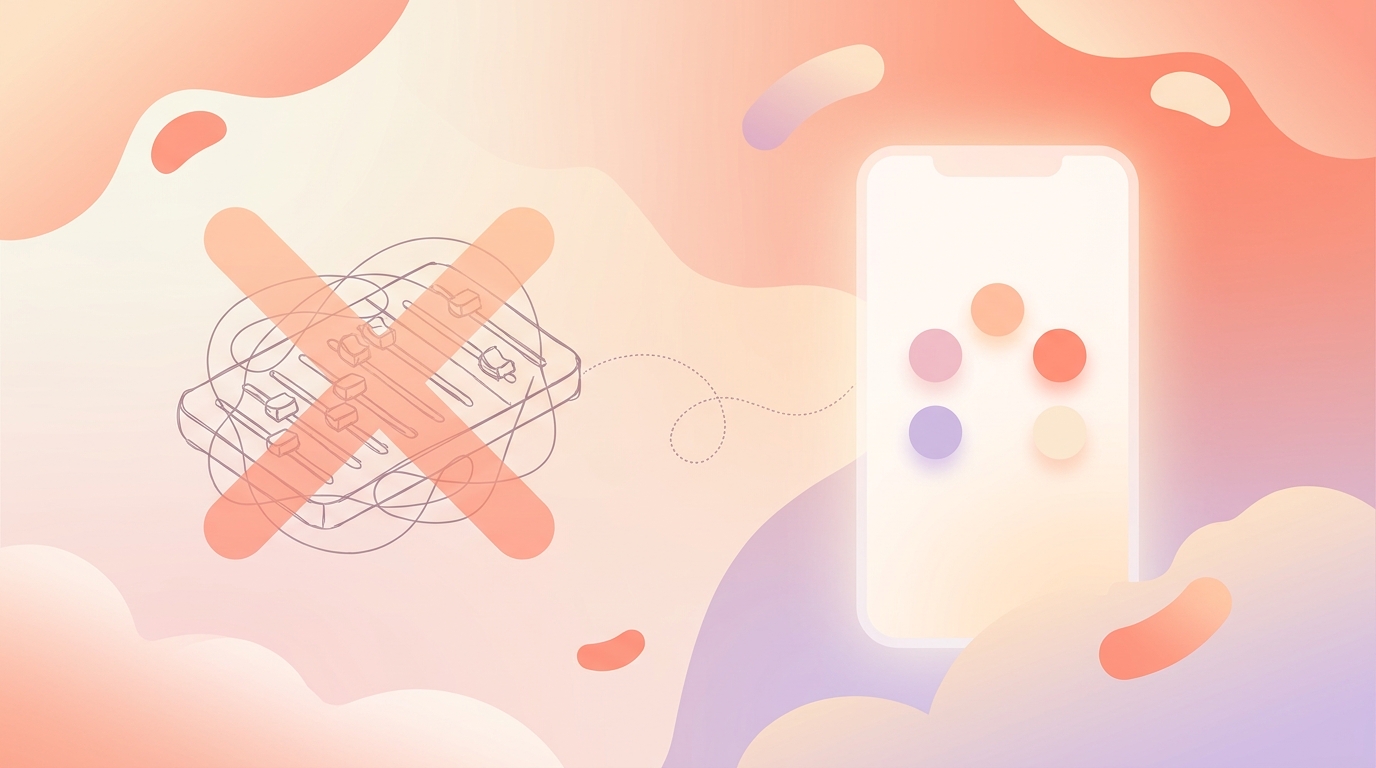
What We Chose Instead We killed the 1-to-10 scale entirely. We replaced it with a simple, 5-grade visual system: Best, Good, Neutral, Low, Worst.
It takes less than 3 seconds to log. There is no nuance to agonize over. We paired this with an optional emoji multi-select for specific emotions and activities. If you want to tap "Low" and then tap the "🌧️" and "💻" emojis to indicate work burnout, you're done. No typing required.
What We Rejected: The 'Smart' Notification Trap
Retention is the lifeblood of any app, and the tech industry's default solution to retention is push notifications.
Initially, we explored a "smart" notification system. The idea was to use machine learning to figure out when a user was most likely to be free, and ping them: "Hey, you haven't logged your mood today! Take 5 minutes for yourself."
We built a prototype and tested it. It was a disaster.
For a neurodivergent user who is already overstimulated, a push notification isn't a helpful nudge; it's a demand. It creates a backlog of guilt. Users felt like the app was nagging them, and when they inevitably broke their "streak," they abandoned the app entirely out of shame.
The Alternative: Gentle Gamification Instead of toxic retention tactics and demanding notifications, we shifted to passive, gentle gamification.
When you log your mood in Vividiary, you feed a small digital clay character. Over 30 days, based on your mood data, this character evolves into one of 8 final forms. There are no streaks to break. If you miss three days, your character just waits for you patiently.
This visual progression rewards consistency in a neurodivergent-friendly way without weaponizing guilt. You don't get punished for forgetting; you just get rewarded for remembering.
Lowering the Bar: Our Shift to Wordless Journaling UX
Even with a simplified mood logger, we still wanted users to get the therapeutic benefits of long-form journaling. But how do you do that without the dreaded blank page?
Our solution was to heavily invest in a wordless journaling approach. We wanted users to be able to capture their emotional state without having to generate sentences from scratch.
We built an AI conversation mode that allows users to seamlessly switch between voice and text in the same session. If you are too exhausted to type, you can just ramble into your microphone for thirty seconds. "I'm just so tired, my boss was annoying, I didn't eat lunch, everything is too loud."
The AI acts as an empathetic companion. It doesn't judge. It doesn't offer unsolicited toxic positivity. Instead, it takes your brain dump and drafts a coherent, first-person diary entry for you.
All the user has to do is review it, make any edits if they want, and hit confirm. We shifted the cognitive load from creation to curation. It is infinitely easier for an exhausted brain to edit an existing text than to write one from scratch.
Under the Hood: Building an Emotionally Adaptive UI Architecture
One of the most fascinating technical challenges we tackled was implementing an emotionally adaptive UI architecture.
According to modern frameworks in Emotional AI Design, interfaces should act as an "Emotion Loop." If a user logs their mood as "Worst," the app shouldn't respond with bright confetti animations, punchy copy, and fast screen transitions. That's a jarring mismatch that can exacerbate sensory overload.
To solve this, we had to design proactive AI companions and an interface that actually "reads the room."
How We Built It We built Vividiary using React Native. We created a global state context that listens to the user's most recent mood log.
- Color Palette: High-contrast brights are swapped for muted, darker tones.
- Animations: Screen transition speeds are reduced by 30% to feel calmer and less frantic.
- Copywriting: The AI companion shifts its tone, slowing down its response cadence and using softer, more validating language.
This isn't just a gimmick. By reducing emotional friction and preventing sensory overload, we create a psychologically safe digital environment. The app matches the user's energy, rather than forcing the user to match the app's energy.
Privacy-First: Securing Your Data in the Cloud
You can't build an emotionally safe app if users don't feel digitally safe. When you are asking people to log their most vulnerable thoughts, privacy isn't a feature; it's the foundation.
Let me be completely transparent about our infrastructure: Vividiary relies on a privacy-first cloud architecture.
We do not claim to be "local-first" or pretend that data never leaves your device. To provide features like AI drafting, cross-device syncing, and long-term pattern recognition, data has to be processed in the cloud.
However, we built our backend using Supabase and Firebase Auth with strict encryption protocols. Your data is encrypted in transit and at rest. We cannot read your diary entries, and we absolutely do not sell your data to third-party advertisers.
Our business model is simple and transparent, which is the ultimate privacy guarantee. We don't need to monetize your data because we monetize the product directly.
- Free Tier: Unlimited mood logging, 3 AI conversations per day, and basic analytics. We want the core therapeutic tools to be accessible to everyone.
- Premium Tier ($2.99/mo or $11.99/yr): Unlimited AI interactions, voice priority processing, and advanced pattern detection (like bubble charts and heatmaps that help you identify emotional triggers over time).
By charging a fair price for premium features, our incentives remain perfectly aligned with protecting your privacy.
The Results: A 40% Bump in Retention
When we ripped out the 1-to-10 scale, killed the smart push notifications, and introduced the wordless journaling UX, we were nervous. We were breaking a lot of "best practices" in product design.
But the retention metrics spoke for themselves.
Within two months of launching the neurodivergent-friendly redesign, we saw a 40% increase in consistent daily logging (defined as users logging their mood 4+ days a week).
Even more importantly, our churn rate among users who self-identified as having ADHD or autism dropped significantly. They weren't just downloading the app; they were sticking with it because it finally felt like a tool that worked with their brains instead of against them.
What's Next We are currently exploring how to make our advanced analytics more accessible. Right now, our premium bubble charts and heatmaps are incredibly powerful for identifying triggers, but data visualization can still be overwhelming. Our next big product challenge is figuring out how to have our AI companion distill those complex charts into simple, actionable insights (e.g., "Hey, I noticed you usually feel 'Low' on Thursdays after back-to-back meetings. Want to block out some focus time next week?").
Designing for neurodivergence isn't an edge case. When you reduce cognitive load, eliminate arbitrary friction, and design with empathy, you don't just build a better app for neurodivergent users—you build a better app for everyone.