
Quick Answer: While Apple's Liquid Glass UI trend offers beautiful, refractive interfaces, ViviDiary rejected it for our core mood tracking after A/B tests showed a 14% drop in logging completion. The translucent, shifting backgrounds caused accessibility issues and overwhelmed distressed users. We opted for a solid, high-contrast UI for our 3-second emoji logging, reserving the Liquid Glass effect exclusively for our opt-in AI helper to visually separate it from the core interface.
---
If you've updated your phone recently, you already know what the mood tracker app UX 2026 landscape looks like. Apple's iOS 27 introduced "Liquid Glass"—a design language defined by dynamic, refractive materials, deep translucency, and shifting background gradients. It is undeniably beautiful. Within weeks of the beta release, our product design feeds were flooded with concepts applying this aesthetic to everything from calculators to health apps.
Naturally, we built a prototype.
And just as naturally, we killed it.
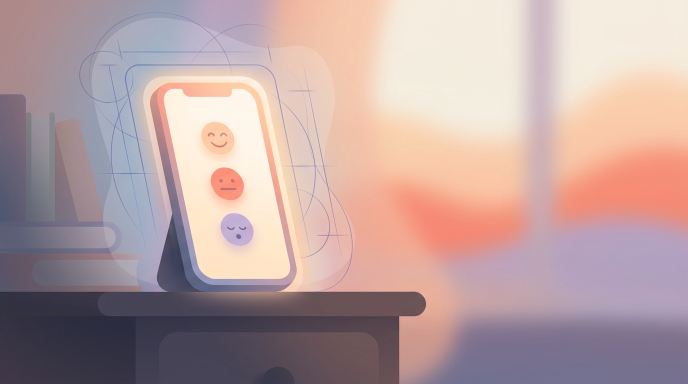
At ViviDiary, our core promise is a sub-30-second logging experience. You open the app, pick one of five moods (Great, Good, Okay, Low, Rough), tap a few emojis, and you're done. No writing required. When we tested a liquid glass mood tracker ui against our standard flat design, the data was brutal. It didn't just fail to improve the experience; it actively harmed it.
Here is the candid story of why we rejected the biggest UI trend of the year, what our A/B tests revealed about user psychology, and why sometimes the best product decision is to stay boring.
The Seduction of Apple's Liquid Glass
The appeal of Liquid Glass is obvious. It makes software feel like a physical, premium object. When we first started exploring how ViviDiary might look in this new paradigm, the mockups were stunning.
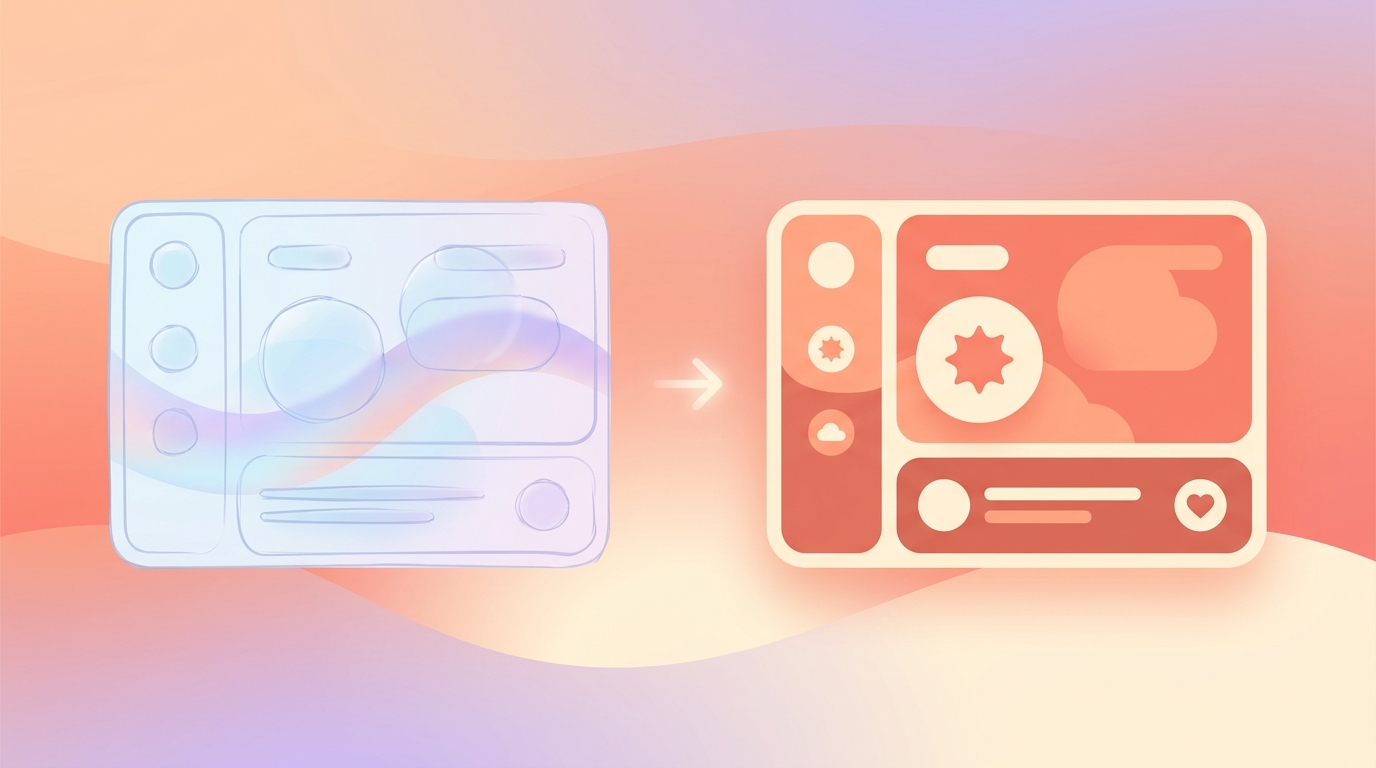
The idea was simple: the background of the app would subtly shift based on your mood history, and the UI elements—the mood selector, the emoji grid, the Focus module—would sit on top like frosted glass, refracting the colors underneath.
We thought this would enhance our "Warm (따뜻하게)" tone. We wanted the app to feel alive, sitting softly beside the user. But there is a massive difference between a static Figma mockup and a living, breathing application used by someone who is having a terrible day.
What We Rejected: The Translucent Emoji Picker
To understand why we walked away, you have to look at the approaches we considered and the technical reality of building them.
Approach 1: Full System-Wide Liquid Glass This was the "all-in" approach. Every module, from the core mood logger to the 22 manual emoji modules and the Focus (Routines + Todos) section, would use native backdrop blurs.
- Looked incredibly modern.
- Felt deeply integrated with iOS 27.
- Performance: ViviDiary is built on React Native and Expo. While the framework is incredibly capable, layering dozens of translucent components using `expo-blur` or `react-native-skia` is computationally expensive. For a user on an older Android device or an iPhone 12, opening the app resulted in dropped frames and noticeable battery drain. We differentiate ourselves by being lighter and faster than competitors; sacrificing performance for aesthetics was a non-starter.
- Visual Noise: ViviDiary is highly modular. A user might have 15 different emoji categories active. Seeing 50+ translucent glass circles refracting a dynamic background turned the screen into a chaotic kaleidoscope.
Approach 2: Hybrid Glass (The Compromise) We tried limiting the glass effect to just the primary mood selector (Great to Rough), keeping the rest of the app flat and solid.
- Better performance.
- Kept the "wow" factor at the top of the screen.
- Created visual inconsistency.
- Still suffered from the core psychological issue we were about to discover in user testing.
A/B Testing: When Aesthetics Hurt Accessibility
We took the Hybrid Glass approach and ran a two-week A/B test with 3,500 active beta users. Group A received the standard solid UI. Group B received the Liquid Glass UI.
The metric we cared about most was the completion rate of the daily check-in. Our baseline is incredibly high because the app requires zero writing and no forced habit-logging.
- Group B (Liquid Glass) saw a 14% drop in daily logging completion.
- Time-to-log increased from an average of 24 seconds to 38 seconds.
When we dug into the qualitative feedback, the reason became glaringly obvious.
7/10 users who reported feeling "Low" or "Rough" during the test period explicitly complained about the interface. One user's feedback became our rallying cry for killing the feature: "When I'm having a panic attack or feeling deeply depressed, I don't want to look at a pretty, shifting, translucent screen. I want a solid button that says 'Rough' so I can hit it and close the app."
Liquid Glass is high-stimulation. It demands visual processing power. When a user's cognitive load is already maxed out by a bad day, a refractive interface is hostile. It directly conflicted with our goal of being a gentle tool that doesn't demand anything from you.
Furthermore, the translucency destroyed our contrast ratios. Our Focus module—which gently tracks opt-in Routines and Todos without pressure-style streaks or guilt-inducing progress bars—became harder to read. A Todo is just a simple item you strike through. When that text is sitting on frosted glass over a moving background, accessibility plummets.
What We Chose (and Why)
We chose to stay "boring." We reverted entirely to our solid, high-contrast, flat UI for the core logging experience.
We use muted, solid colors that meet strict WCAG accessibility standards. The buttons are opaque. The backgrounds are static. When you open ViviDiary, it is quiet. It doesn't dazzle you; it just listens.
The Opt-In AI Helper: Where Glass Actually Makes Sense
We didn't throw the Liquid Glass code away entirely. We found exactly one place where it solved a UX problem: our opt-in AI helper.
Let me be clear about what AI is in ViviDiary. It is an optional supporting tool for the days you want to record more deeply. It is not the core selling point. It doesn't save or confirm anything without your review, and it certainly doesn't provide therapy or pressure you into goal achievement.
Because the AI chat is a distinct, heavier interaction compared to the 3-second mood log, we needed a way to visually signal a "mode shift" to the user.
Here, Liquid Glass was perfect.
- It visually separates the AI conversation from your permanent, core diary entries.
- It signals that you have moved from "quick logging" mode into "reflection" mode.
Because this is an opt-in feature used less frequently than the daily log, the performance overhead of the rendering is acceptable, and the visual distinction actually aids navigation.
Beyond the Surface: Cloud Storage and De-Identification
Whenever we discuss our AI helper or data-heavy features like our weekly Mirror (which observes patterns across Time, Activity, People, and Focus), the conversation inevitably turns to privacy and architecture.
In the mood tracker app UX 2026 space, there is a rampant trend of companies claiming complete data isolation. We refuse to use this marketing speak because, for the vast majority of apps offering seamless cross-device syncing and AI features, it is simply false. Instead, we protect your privacy through strict data minimization and de-identification.
Here is the transparent truth about ViviDiary's architecture:
Our data layer is cloud-stored using Supabase. We chose this because we want users to trust that their 3-month calendar archive (available on our Free tier) or their multi-year history (on our $2.99/mo Premium tier) is safe, synced, and recoverable if they drop their phone in a lake.
Our privacy model does not rely on the myth of offline isolation. Instead, our privacy comes from data minimization and de-identification.
If you choose to use the opt-in AI helper, your diary text is strictly de-identified before any external or AI processing occurs. We strip out the identifiers before the data ever touches an LLM. We built it this way because we believe privacy is about responsible data architecture, not pretending the cloud doesn't exist.
What's Next
Rejecting the iOS 27 Liquid Glass trend for our core UI was one of the easiest hard decisions we've made this year. It reminded us that our primary job isn't to win design awards; it's to build a tool that feels safe and effortless on a user's worst days.
Looking ahead, our engineering team is focused on expanding the modularity of the app. We are currently testing new ways to let users customize their 22 emoji modules, and refining how the weekly Mirror surfaces insights without ever becoming prescriptive.
We will continue to watch UI trends closely. We'll prototype them, we'll test them, and if they get in the way of a 30-second check-in, we'll gladly kill them again.